Spot the Signals Before They Become Surprises.
Turn a few high-level inputs into a clear view of growth, churn, CAC, and payback without new tools, integrations, or complicated setup.
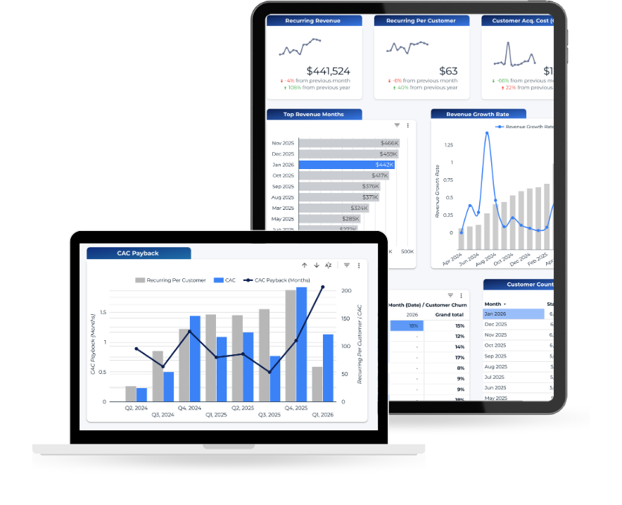
Revenue trends by month
Revenue growth rate
Recurring revenue per customer
Customer churn percentage
Gains vs. losses over time
Seasonal churn trends
Customer acquisition cost (CAC)
CAC payback period
Top revenue months
No modeling. No integrations. Just a clearer view of how revenue, retention, and spend are interacting.
See Patterns That Are Easy to Miss
Most teams already track revenue and spend. Few see them in context.
When revenue, churn, and acquisition costs live in separate reports, it’s hard to answer basic questions:
- Is growth coming from new customers or masking losses?
- Is churn seasonal or trending upward?
- How long does it really take to earn back acquisition spend?
- Are certain months consistently stronger or weaker?
This dashboard helps you spot patterns early so you know where to dig deeper.


A 10-Minute Setup Using Google Tools
No new software. No subscriptions. No hidden paywalls.
- Enter your recurring revenue, starting customers, customers lost, and monthly sales and marketing spend into a Google Sheet template.
- Copy the pre-built dashboard template.
- Connect it to your spreadsheet.
You’ll receive step-by-step instructions with screenshots to make setup straightforward.
Built for Founders and Operators of Recurring Revenue Businesses
This dashboard is designed for leaders who:
- Have recurring or subscription revenue
- Know their customer counts and spend in aggregate
- Want a fast revenue health check without hiring an analyst
- Need clearer visibility before making growth or cost decisions
If you already have the numbers but not a clear performance view, this gives you one.

What our clients say
“Her remarkable talent for bringing data to life and seamlessly integrating it with practical decision-making is unparalleled.”
“She went beyond the surface level, delving into data with a keen understanding and presenting it in a manner that was easily digestible for individuals across different knowledge levels.”
“Meghan possesses a strong ability to gather, interpret and analyze data, and then transform it into actionable insight that helped our team, as well as our customers.”

Not a Full Diagnostic. A Performance Pulse.
This is not a root-cause analysis tool.
It won’t tell you exactly why churn increased or which campaign drove growth.
It will show you where something deserves attention.
Think of it as a performance pulse that helps you prioritize where deeper analysis would have the highest return.
We care about helping growing businesses get better with the tools they already have.
We believe performance improves when leaders can see what’s actually happening. Too often, that visibility sits behind expensive tools or unnecessary complexity.
This dashboard removes that barrier. It gives you a straightforward way to pressure-test revenue health using what you already have.
If it helps you spot something worth digging into, it’s done its job.

Get New Free Tools When They’re Released
Stay ahead of the game with freebies, updates on the latest trends, and new ways to get more out of your data.
Never spam. Unsubscribe at any time.